Niio Editorial
Florence Lefebvre is a self-taught French digital artist whose practice emerges from a lifelong dialogue with the sea. Growing up with formative summers in the South of France and later observing the shifting coasts of Normandy, Brittany, and the North Sea, she developed a deep sensitivity to tides, light, and movement. What began as hours spent underwater with a mask and snorkel evolved into a visual language built from fluidity, rhythm, and transformation. Today, she translates these marine memories into immersive digital compositions, describing herself as a “digital explorer” navigating an ocean of pixels.
Following the launch of her solo artcast Waltz of Flowers on Niio, we had a conversation about her creative process and the sources of her inspiration.
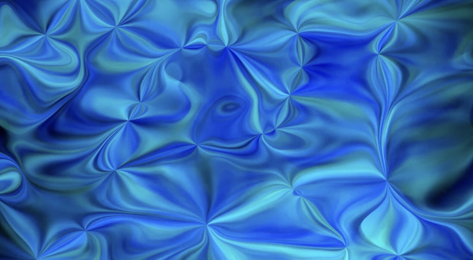
Florence Lefebvre. Waltz of Flowers #1, 2022
You have stated that your work draws its inspiration from “marine emotions.” Could you share with us a specific memory, place, or marine sensation that continues to inspire your work today?
For me, the sea is an emotional language: an endless immersion where fluid, uninterrupted movement inspires my digital exploration.
Every summer, during long family holidays in the South of France, I discovered my first wonders beneath the surface of the water. Equipped with just a mask and snorkel, I spent hours exploring this secret realm, fascinated by the light filtering through the waves and the shifting reflections. The green of the seaweed rippled gently, while fish, their hues ranging from red to orange, then to blue and silver, moved through this world like a living dance. These moments instilled in me the beauty of rhythm, color, and movement—essential elements of any artistic composition.
“My creations immerse us in a universe where art transcends the boundaries of the canvas!”
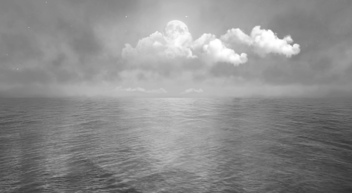
Even today, I regularly observe the beach and the sea along the Normandy and Brittany coasts, as well as in the North Sea, where the tides constantly create new patterns on the sand and alter the dance of the waves. On winter mornings, on calm or windy days, I watch the light change with every moment: the sky merges with the sea, clouds stretch to the horizon, and sometimes silvery reflections illuminate the surface. I feel fully connected to this shifting space, attentive to every ripple of the water and every variation of color brought about by the tides.
The sea has taught me that nothing is fixed, that everything is fluid and transformative. In my digital ocean, each pixel becomes a grain of sand to explore!
My art is a dialogue between the real and the digital, where each composition carries the memory of an inner journey that continues endlessly!
Florence Lefebvre. Stellar Melodies, 2025
In your work, you prioritize contemplation first, then mastering the production process. What does “contemplation” look like in your daily practice?
For me, contemplation is an active immersion, the starting point of all creation. It always begins far from screens, with careful observation of nature. I am deeply moved by the spectacle of the tides and the perpetual movement of the waves.
My approach unfolds around three axes: flow and energy, forms and textures, and time for reflection. By exploring the Normandy and Brittany coasts, I capture the metamorphosis of the shores under the action of the sea, the power of the waves, and the fluidity of their movements. I linger on the rhythms of the water, the undulations of the sand, the contrasts between rock and sea, building a repertoire of sensations that I then transpose into my digital creations.
“It is during my walks along wild coastlines that my works take shape in feeling, before technology becomes an extension of my gaze”
The settling time involves knowing how to detach oneself from the digital world, allowing these impressions to organize themselves internally. It is during my walks along wild coastlines that my works take shape in feeling, before technology becomes an extension of my gaze, transcribing into images what the sea has whispered to me.
My art is thus a dialogue between the real and the digital, a perpetually transforming flow, where each pixel mirrors an instant, as a grain of sand carried away by the tide.
Florence Lefebvre. Link Oceanbound, 2026
When did digital creation become the medium where you felt you could “fully” express your sensitivity, and what did it reveal that other forms did not allow?
One day, I embarked on this artistic quest of creativity and exploration as a self-taught artist, using whatever tools I had at hand. I explored, tested, observed, experimented, and created with passion, fascinated by the possibility of bringing to life the movements, textures, and colors I had observed in the sea since childhood. This moment remains very important to me because it marked the beginning of an intense period of artistic creation. I instinctively grasp computer tools and naturally become familiar with them, while working regularly and rigorously, which allows me to acquire technical mastery of the software. It’s a passion fueled by daily exploration, research, and creation.
“The sea has taught me that nothing is fixed, that everything is fluid and transformative. In my digital ocean, each pixel becomes a grain of sand to explore!”
Digital creation became a universe for me where I could fully express my sensitivity when I felt the need to translate the flows, movements, and nuances of nature in a more immersive and vibrant way. Unlike other traditional forms, digital art allows me to capture the fluidity, light, and rhythm of my marine memories, to create subtle movements, infinite oscillations, and to experiment with variations of color and texture that paper, canvas, or sculpture don’t always allow.
Throughout my exploration, I also developed a passion for flowers, which I animate like peintures mouvantes (moving paintings), creating a dialogue between nature and digital art to produce living, poetic works.
This creative space has revealed to me that emotion can be immersed, amplified, and reinvented; that each pixel can convey a feeling; and that the interaction between the real and the virtual opens an infinite dialogue with the viewer. Where other forms could freeze a moment, digital art allows me to bring movement and transformation to life, to recreate the memory of ocean currents and the dance of the elements, while remaining true to my vision and artistic intuition.
Since then, I’ve defined myself as a digital explorer, approaching the screen as an ocean of possibilities. Each video I create becomes an immersive atmosphere, where every shape and color contributes to the experience and the feeling, offering a dialogue between the real and the virtual.
“Unlike other traditional forms, digital art allows me to capture the fluidity, light, and rhythm of my marine memories”
Florence Lefebvre, Infinitesimal, 2023
Your work often revolves around “digital fluids and forms.” Are these abstractions meant to evoke water, emotions, memory, or something else?
I work with digital fluids and forms to translate what I feel in the face of the sea and life, rather than representing the world literally. Water, with its fluidity and oscillations, becomes a central metaphor: it evokes movement, emotion, memory, and transformation.
For me, digital art is a space of infinite exploration, where each work can evolve, reinvent itself, and engage in a dialogue with the viewer.
I create dynamic and evolving fluids, where each element transforms and interacts across multiple dimensions. This universe allows me to explore inaccessible realms, where movement and color harmonize perfectly, offering the viewer a true escape.
“My goal is for the artwork to transport the viewer, transforming their contemplation into a unique emotional experience.”
Each work is born from a subtle balance between observation of reality and digital exploration. Waves, currents, and ocean currents inspire my rhythms and textures, but these elements are reinvented as free abstractions, capable of conveying the flow of an emotion or the memory of a moment.
My goal is for the artwork to transport the viewer, transforming their contemplation into a unique emotional experience. Each creation is designed to resonate with the space around it and invite everyone to feel emotion, a memory, or a sense of escape.
My works thus become a space for exploration where the viewer can perceive movement, color, and depth, while giving free rein to their interpretation. Digital fluids are therefore not just water: they constitute a visual language that evokes feeling: a dialogue between real and virtual, memory and emotion.
Florence Lefebvre. Link Electric Divide, 2026
You mention algorithms and multidimensional composition. How do you reconcile control and emergence, and at what point do you want surprise to appear in the image?
In my work, control and emergence interact like two complementary forces. Through the software’s algorithms, I shape my creations, orchestrating rhythms, textures, and movements that I wish to explore.
However, I always leave room for surprise, because it is often in the unexpected that the most poetic and vibrant moments are born. Sometimes, a flow reacts differently, a color blends differently, a ripple forms unexpectedly: these moments become creative triggers that I then choose whether or not to incorporate.
I then become a conductor, or rather a captain: I steer my digital compositions with intention and mastery, while leaving the necessary space for emergence. “Ctrl+Z” becomes my magic wand: surprise is no longer a constraint, but the wind that fills my sails toward the unknown, transforming the unpredictable into an opportunity for exploration!
Florence Lefebvre. Flowergraph, 2022
You speak of linking contemporary life to the “cradle of primitive life.” What does “primitive” mean to you: biology, mythology, evolution, spirituality, or a psychological state? Your goal is to represent “the depths of the subconscious.” Do you start with an emotion and then find an image for it, or with an image to discover the emotion later?
I perceive the primitive as the vital force that animates the entire universe, a cradle of life that is simultaneously biological, instinctive, and psychological. It is this raw energy that flows through nature, from ocean currents to distant stars, and that inspires creation. My approach is akin to a biology of the imagination: an exploration of matter coming to life, where instinct and memory intertwine with digital technology.
My goal is to represent the depths of the subconscious, where emotions and memories converge. Sometimes, I begin with an emotion, allowing it to percolate and transform into image, form, and movement; sometimes, an image emerges spontaneously, revealing the latent emotion it carries. In all cases, the unexpected becomes the raw material of creation, and the primal, a living and inspiring source.
“I have also developed a passion for flowers I animate like peintures mouvantes (moving paintings), creating a dialogue between nature and digital media.”
The orchestration of my digital fluids allows me to create shifting, dreamlike worlds where life, poetry, and the invisible meet. I explore the infinitely small with works like “Infinitesimal,” observing digital fluids under a microscope.
In my series ‘Abyss’ and ‘The Secret of the Abyss’, the ocean depths mingle with the subconscious, giving rise to abyssal creatures that I call ‘Abyss’, born in the heart of these depths and bearers of the mysteries of the ocean. Finally, the celestial journey with the “Nebula” series connects the ocean depths to the most distant stars, continuing this quest for energy, cosmic fluidity, and infinite reverie.
Digital art offers me immense freedom of exploration, a boundless, dreamlike, and ever-shifting universe where the invisible becomes visible and the unexpected transforms into living inspiration.
Florence Lefebvre. Confusion, 2022
A significant portion of your work is abstract, dominated by fluids and fluidity, with some references to nature. However, some of your most recent works, created with AI models, lean towards figuration, with scenes reminiscent of street art and early hand-painted photographs. What does AI bring to your creative process that has motivated this evolution towards figurative compositions?
AI is primarily used in my work when I explore figurative art. It allows me to develop scenes, characters, and visual worlds that I explore through various themes, from street art to early hand-painted photographs, including sketches reminiscent of drawing or comics.
I use it as a tool for shaping and experimentation: I define the intentions, adjust the parameters, select, refine, and rework the images. The AI generates suggestions, but the vision, direction, and aesthetic choices remain entirely my own.
“Working with AI is not a change of direction, but an expansion of my artistic language, where each work, with its own tools, contributes to the same vision.”
What interests me is not just the speed of execution, but above all the possibility of exploring a wide variety of subjects and styles without hindering the creative flow. Where my passion for digital fluidity explores colors, flows, geometric shapes, and multidimensional interactions, AI allows me to introduce a narrative dimension.
The common thread remains the same: life, color, and the subtle connections that interact with each other.
This is not a change of direction, but an expansion of my artistic language, where each work, with its own tools, contributes to the same vision.
Florence Lefebvre. Pop Culture, 2022
You stated that your work transcends the canvas, incorporating 3D and movement. What is your ideal viewing context: phone, large screen, installation, home space? And how does this context influence the perception of the work?
My work transcends the traditional canvas, incorporating 3D, movement, and an immersive dimension. I design my pieces to be felt in space, not just seen.
The viewing context plays a central role in the perception of the work:
- Large screen or projection: this is ideal for fully experiencing the fluidity of movement, the depth of textures, and the Waltz of my flowers. The viewer is immersed in the universe I have created. The animated flowers, which I conceive as moving paintings, reveal all their subtlety, creating a poetic and immersive dialogue between nature and digital technology.
- Installation or dedicated space: the artwork engages with its environment, and the viewer becomes an active participant in the perception, moving around the piece, discovering details and dynamics depending on the viewpoint.
- Phone or small screen: even on a smaller screen, the artwork retains its power. Some details or subtleties of movement may be less perceptible, but the experience becomes more intimate, offering a direct connection that integrates into the viewer’s daily life.
- Everyday setting: the artwork interacts with the rhythm of life and the environment, creating an emotional resonance where the digital and the living meet in everyday life.
Thus, the format and context influence how movement, depth, and narrative are perceived. I aim for a subtle balance between individual connection and total immersion in the world of my artworks, respecting the fluidity and energy of each piece, so that the viewer can fully experience the movement, color, vibration of the flows, and the digital life I seek to convey.
Florence Lefebvre. Waltz of Flowers #2, 2022
Regarding the context of experiencing the artwork, how do you think Niio and other companies that distribute digital art on public screens can benefit artists and art lovers? What has been your experience of presenting your work on digital screens in public spaces?
Niio displayed two works from my collection, “Waltz of Flowers” and “LINK,” on a high-quality screen at an event in a prestigious hotel. This was an enriching experience, as it allowed a wide audience to discover my creations and perceive the interaction between digital art and space. Seeing artworks presented on screens demonstrates how essential these exhibitions are in making digital art accessible and introducing it to a diverse audience.
Platforms like Niio and other companies that broadcast digital art on public screens offer artists invaluable visibility and allow their work to reach a wider audience. They also make digital art more accessible by integrating it into everyday spaces, where passersby can spontaneously discover the works.
I would also like my work to be exhibited in art galleries, where the context fosters a more attentive and contemplative experience. In this setting, the public can take the time to look at and interpret the works, creating a deeper dialogue between the artwork, the space, and the viewer. It is also an environment that encourages exchanges with visitors, curators, and other art professionals.
“Platforms like Niio offer artists invaluable visibility and allow their work to reach a wider audience”
I am also very interested in the possibility of collaborating with other artists on joint projects. Working with multiple artists allows for the confrontation of different approaches, techniques, and sensibilities, thus enriching the creative process and paving the way for more experimental or ambitious projects.
I am curious to see how my work can engage in dialogue with other artistic practices and different exhibition contexts, and I would like to explore new forms of interaction between the artwork, the public, and the space.