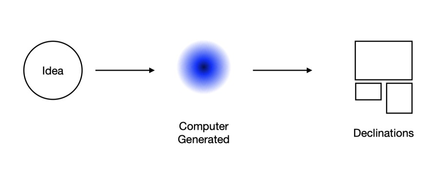
This article is the first of a series about the symbolism of colors based on the writings of historian Michel Pastoreau. According to Pastoreau, in terms of their symbolism and adoption by human societies, we can only speak of six colors: blue, red, white, yellow, green, and black. Taking inspiration from his texts, we have curated six artcasts that show how artists use these colors in their work and exemplify the ways in which they are incorporated into digital art.
We invite you to learn more about the symbolic connotations of each color and experience the artworks on your own screen.
Blue is the color that makes the perfect background. It doesn’t stand out, it is calming and invites consensus. Large organizations choose blue to denote sobriety and group consensus, as can be seen in the flags of the United Nations and the European Union. It is the color of the sea and the sky: a peaceful, quiet, conservative color. Pastoreau states: “since about 1890, blue became the prominent color in Western societies, as much in France as in Sicily, in the United States and New Zealand […] In other cultures something different happens: most Japanese, for instance, prefer black.”
Large organizations choose blue to denote sobriety and group consensus, as can be seen in the flags of the United Nations and the European Union.
However, blue has not always had these connotations. In ancient Rome, it was the color of the barbarians, the foreigners. There wasn’t a name for blue, which had to be borrowed from the Germanic blau or the Arabic azraq. In the 12th and 13th centuries, blue gained popularity in Europe thanks to the cult of the Virgin Mary, and was later adopted by royal families. In the 16th century, the Reformation promoted the idea that certain colors were more decent than others: black, grey, and blue became associated with correctness and adopted in masculine garments.
The invention of Prussian blue in 1720 popularized darker tones that were quickly adopted by Romantic painters and poets. In 1850, the Jewish tailor Levi-Strauss invented jeans, an indigo-colored trousers which introduced blue to the workspace, and later became associated with leisure, in the 1930s, and even a sign of a rebellious attitude, in the 1960s. Nowadays, blue is mostly perceived as a calm, conservative color, particularly in politics, as a reaction to the prominence of red in the communist regimes of the Soviet Union and China.
Patrick Tresset. Scene 11, Human Study #1, Hong Kong series, 2022
In the realm of the digital image, blue has acquired very different connotations: it can be electric, vibrant, an outlandish blue that can only exist in the virtual world. In 1993, Mosaic, one of the first web browsers, introduced blue hyperlinks to differentiate clickable text in addition to underscoring, which Tim Berners-Lee had introduced in his first browser in 1987. Standing out on the white, light gray, and yellow backgrounds of early browsers, blue became the color of the Internet in the 1990s. It has since been routinely adopted by tech companies, both for its association with electricity and machinery as for its dual conservative and rebellious symbolism. Leading social media platforms Facebook, Twitter, and LinkedIn use blue in their logos, denoting seriousness, consensus, and stability (although these words do not particularly apply to the current state of platforms such as Twitter). Blue has become the color of online communities, and even alternative channels such as Discord, Signal, or Telegram all use blue in their brands.
Leading social media platforms use blue in their logos, denoting seriousness, consensus, and stability. Blue has become the color of online communities
The chroma key compositing technique used in film to combine two or more elements recorded separately initially used black or white backgrounds, until in the 1930s RKO Radio Pictures introduced the blue screen method. The Thief of Bagdad (1940), which won the Academy Award for Best Special Effects, was the first film to use this technique. Blue has since been used, alongside green, as a background in film sets, and therefore associated with visual effects, and particularly science fiction blockbuster films such as Star Wars.
The popularization of cyberpunk, a literary genre that responds to the utopian science fiction stories of the 1950s, brought a darker shade of blue to our visions of the future. Ridley Scott’s 1982 film Blade Runner, an adaptation of Philip K. Dick’s novel Do Androids Dream of Electric Sheep? (1968), pictured a dystopian future in a dark and rainy city of Los Angeles dominated by immense screens and neon lights. In William Gibson’s Neuromancer (1984), the sky is blue gray, “the color of television, tuned to a dead channel.” Blue has thus been associated with technology, science fiction, and virtual worlds since the 1980s and 1990s. It was partly replaced by the popularity of phosphor green, associated with hacker culture and popularized by films such as The Matrix trilogy (1999-2003), but was brought back by a wave of 1990s nostalgia exemplified in the work of Post-Internet artists in the early 2010s.
Alix Desaubliaux. Alexandra Erlich-Speiser, 2021
Nowadays, blue is used in digital art in the same way as in painting, to denote melancholy or to represent a blue sky or a calm sea, but also as a distinct color of virtual worlds and to symbolize artificiality. Blue continues to be a conformist, calm color, but in our digital society it has also become associated with connectivity, ubiquity, and community.
Fabio Catapano is an Italian digital artist and designer who works with code, CGI, and motion. Encouraged by the possibilities that the NFT market has opened to digital artists, he is developing a growing body of work inspired by Japanese aesthetics and creating generative art that moves away from strict geometry and explores the poetic side of creative coding. On the occasion of his solo artcast A Theory of Color, we had a conversation about his creative process and his views on the future of digital art.
Fabio Catapano. Colorem 221201, 2022
What took you to create your artworks using generative algorithms and how would you describe your creative process?
It was the result of a series of choices. When I was younger, I worked for a long time as a VJ making visuals for clubs and musicians. In that process, you need to create a lot of video content, and I used a software called Quartz Composer, which is pretty much one of the first node-based generative system software programs. Besides my work as a VJ, I have always been passionate about programming languages and I learned some Visual Basic as a hobby. So I had both the interest and the motivation to use this software and explore the creative possibilities of generative algorithms. Since what I did is write the code and then the system would generate the outcome, I found it fascinating to ask myself who is the creator, me or the machine? I feel that we are co-creators, and the software is not just a tool, it is something else.
“I take cues from the way software developers think and collaborate, how they create iterations and updates of the same program.”
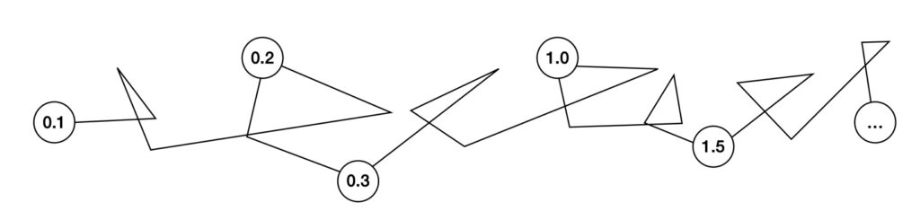
The initial idea for an artwork can originate in a shape, the feeling of motion, or a texture, colors, or the combination of two or more elements together. The process in itself is very, very experimental, a form of research in which every outcome is a good outcome. How the project develops is very spontaneous: for instance, I started two years ago with the series Coloremand I wasn’t expecting to create so many pieces. But I ended up creating day after day a different iteration of the same system in a way that felt as a journal of the whole process. I take cues from the way software developers think and collaborate, how they create iterations and updates of the same program. This is why the artwork titles include a reference number that indicates the date of creation and are therefore similar to the versions in a computer program.
Working in iterations. Diagram by Fabio Catapano.
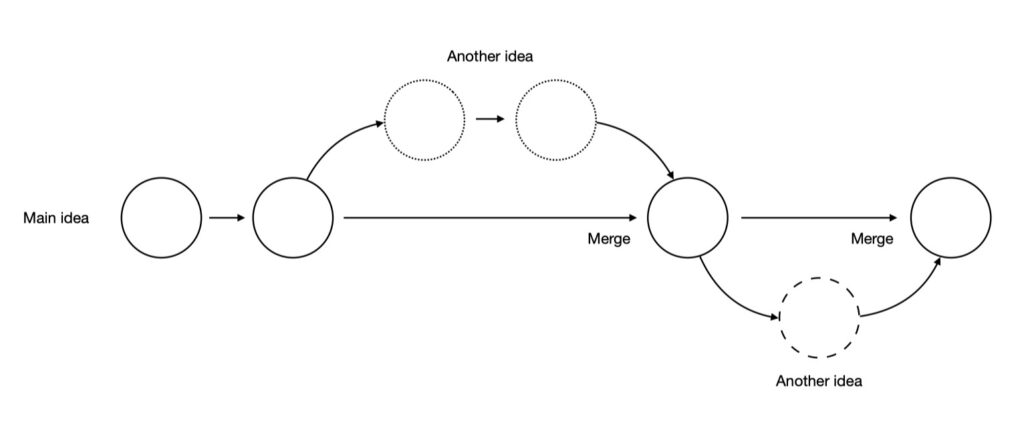
Every day there is a different outcome and a different exploration, that may be driven by a series of colors, or shapes, or something that I did before. Sometimes I want something that is a bit more grainy, or a bit more clean. But none of those, in my opinion, are the correct answers. They are just moments in time, part of an exploration. That’s pretty much how I started to work with generative art.
Ideas lead to other ideas. Diagram by Fabio Catapano.
Color plays an important role in your latest series of works. This is an element that is crucial both to designers and visual artists. How do you work with color in the different facets of your professional work? What led you to make it a central part of your artistic research?
It’s funny, because many years ago –I was 17 back then– when I started to create digital art with Photoshop and other programs, it was very colorful. After that, I discovered generative art, and I shifted to black and white. I did so because I was more focused on learning the system and how to create genuine art. So I was more interested in how to create shapes and decided to remove the colors from the equation, and everything became black and white. But then I realized that there was nothing really creative about it. Many other generative artists at that time were creating very geometrical, black and white art that, to me, looks only like a lazy version of a work by Bridget Riley. So I was learning but it felt like I was bringing nothing new to the conversation.
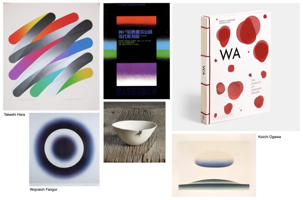
That’s when I started to shift to colors. I also did so because I wanted to do the opposite of what you expect from computer art, very geometric and strict, with shapes but not colors. I wanted to show that a computer can dream. So I created these shapes that are fluid and can move from one color to another. Also at that time I became interested in the Japanese concept of wabi-sabi, which deals with appreciating the simplicity, imperfection, and mutability of things. I took inspiration from the book WA: The Essence of Japanese Design by Rossella Menegazzo and Stefania Piotti, which shows how Japanese artists such as Takeshi Hara or Koichi Ogawa, among many others, manage to bring such quality in the designs they create. I was also inspired by the Polish artist Wojciech Fangor. I love the way these artists deal with simplicity, structure, and color.
Japanese inspiration. Images collected by Fabio Catapano.
I also want to show that generative art can be something else, not just the geometrical art that is usually represented by the cyberpunk community. Generative art does not need to be futuristic, it can be something else: it can be white, it can be slow, it can be dreamy… Slowness is also important to my work because nowadays everything goes very fast in our digital lives, social media promotes content that grabs attention in the first three seconds, and I intentionally try to go in the opposite direction, towards a calm and slow contemplation.
“I wanted to do the opposite of what you expect from computer art, very geometric and strict, with shapes but not colors. I wanted to show that a computer can dream.”
While you work with generative algorithms, the outputs of your work are usually still images, videos, and prints. How do you work with these different formats? What makes you choose which will be the final shape of a particular piece?
I have released only one project as a software, Origami, that generated a new output every time it was minted, in a limited edition. This was on (fx)hash, last June. I have never released an artwork as a software that someone can run on the computer, mostly because I find it complicated to explain and distribute. However, I think that, for instance, Colorem as work shouldn’t be a video, it should be software. Because the idea is that it can run there and just constantly change and never be the same. But that’s pretty much true for any generative artwork. So if one day I find a way to distribute those ideas through software, I will be happy to explore further and introduce a new layer of variability and new layer of randomness that is informed by an external factor. I would like the artwork to be detached from me at some point.
Creating with a computer. Diagram by Fabio Catapano.
In my work I try to think in a more fluid way where I don’t care much about, for instance, the ratio, because ideally with a few clicks I can change the format. And if I work in a print on paper, then I choose a particular moment in the process which to me is interesting, and that can stand on itself as a static artwork. There is also an important process taking place when I create a print, which involves choosing the paper and seeing how the pigments react to the paper, and how the texture of the paper gives a new dimension to the colors. Actually, working with paper inspired me to introduce grainy textures in my digital artworks and try out gray backgrounds, which is something I am still experimenting with.
In this sense, something that is interesting is that artists today can work in a way that artists before couldn’t: today we can use social media as a lab, by posting tests and experiments and getting a response from your audience. To be honest, it is important for me what my followers say, to have that feedback, because I don’t create the artworks to just put them in a drawer, I want them to be seen.
Another format that I want to work with is projection. As a VJ, I worked a really long time with a projector. And I’m missing right now that in the equation: I have a screen that emits light. I have a paper that receives light. But the projector does something else, it throws light on a surface. That is way more interesting because that again becomes not just an image, it becomes a lighting solution. And the reason why I haven’t tried that yet is because you need the right projector, the right space with the right amount of light, the right attention from the audience, and stuff like that. It’s nothing new, of course, but I would really like to explore that other avenue.
Fabio Catapano. Colorem 221025, 2022
You have been nominated as one of the ten most influential NFT artists in Italy. What has the NFT market brought to your practice, what do you find most interesting in distributing your work in this format?
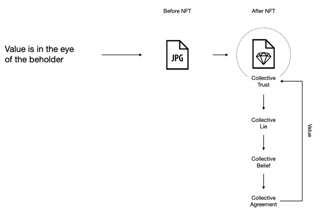
There is this well-known saying: “beauty is in the eye of the beholder.” I’d say that also value is in the eye of the beholder. What this means is that, after NFTs, even JPEGs have gained value, a value that is supported by a collective agreement and a collective trust. So we decided that the JPEG from now on is not just a JPEG that one can find on the internet, but is a JPEG that can have a $1 value and tomorrow can increase that value to $2 and so on. So, what the NFT market brought me as an artist is a community and a collective trust that turned digital art into something valuable. We know that digital art has existed for many years, and that it has had its value, but suddenly, we have more attention. And it’s a good thing, because there are many projects, many museum shows, and many new things happening. To me it has also meant being able to proudly say: “I’m a digital artist,” and that people can understand what that means.
Value is in the eye of the beholder. Diagram by Fabio Catapano.
On the other hand, the NFT market brought me some revenue and the opportunity to focus on the practice itself. I launched my Genesis with SuperRare. The series was called Data Collector, and it referred to the fact that nowadays collectors are actually collecting data, a bunch of information that moves from one wallet to another. And suddenly this data has value, because we all agreed that it has. So I took these classic statues and made them into particles that move like data moves from one wallet to another. Beyond art, I think that NFTs and blockchain technology will be very important in many more aspects of our lives.
“What the NFT market brought me as an artist is a community and a collective trust that turned digital art into something valuable.”
Having participated in exhibitions in museums, galleries, and also metaverses, what would you highlight in these spaces as the most interesting for the presentation of your work?
I would say that the one space I don’t like is the metaverse as it is designed right now. I see no reason why I need to have a puppet moving in a digital world, watching very low resolution JPEGs. Why do you need a room at all? Additionally, what is being offered now looks like a cheap version of a video game. In fact, I’d say that Fornite and Minecraft are better “metaverses” than most projects I’ve seen.
Then when it comes to galleries, I have to say that most of the people running these spaces don’t know how to display digital art, because they don’t understand the medium. They don’t understand its physicality and the technology behind it. Now everyone wants to jump on this trend, but there are so many things that you need to consider: choosing the screens, the right environment, the lighting, and so forth. Still, I believe this will change and it will get better.
Fabio Catapano. Colorem 221207, 2022
How would you compare your creative process when working with a brand as a designer and when you are creating as part of your own artistic research?
An artist today has to be many things at once: a designer, a photographer, a marketer… There are a lot of things that probably have been there before, but today even more so because the market is more competitive. In my commercial projects, I didn’t actually create the work for them. Rather, the brand bought an artwork I had made and licensed it to use it in their communications and design. It is more and more common that art and design are combined or fused in some contexts. Design is great, but it can be very dry from a storytelling point of view, while art can push those boundaries and can explore new visions.
Fabio Catapano. Colorem Fragments v1, 2022
You have expressed interest in the possibility of displaying digital art on any screen, in a way that can be compared with street art taking over public space. From the perspective of sociology and anthropology, how do you see this presence of digital art evolving in the future? It is clear to me that we are increasingly surrounded by screens and digital devices. We have quickly switched from having one television set per home to having multiple TVs, smartphones, tablets, and computers. These screens are also closer to us than the television set ever was, and they are not in one room anymore, they move with us and invade every space we inhabit, also the public space. Looking at films like Blade Runner, I see a future with screens everywhere, in which the content will be customized to every user. This can also happen from an artistic point of view, so for instance the content is actually related to the person that is looking at it. Similarly to what is happening now with NFTs, every person is identified by their wallet and carries their art collection with them, wherever they go. With connected screens, we will be able to take our art with us and enjoy it wherever we are.
Niio is proud to introduce a selection of artcasts by celebratedphotographers in collaboration with Fahey/Klein Gallery, the leading contemporary photography gallery in Los Angeles. Curated by Nicholas Fahey, these selections dive into the work of the artists, presenting key series and iconic images, and are available to our members for a limited time only.
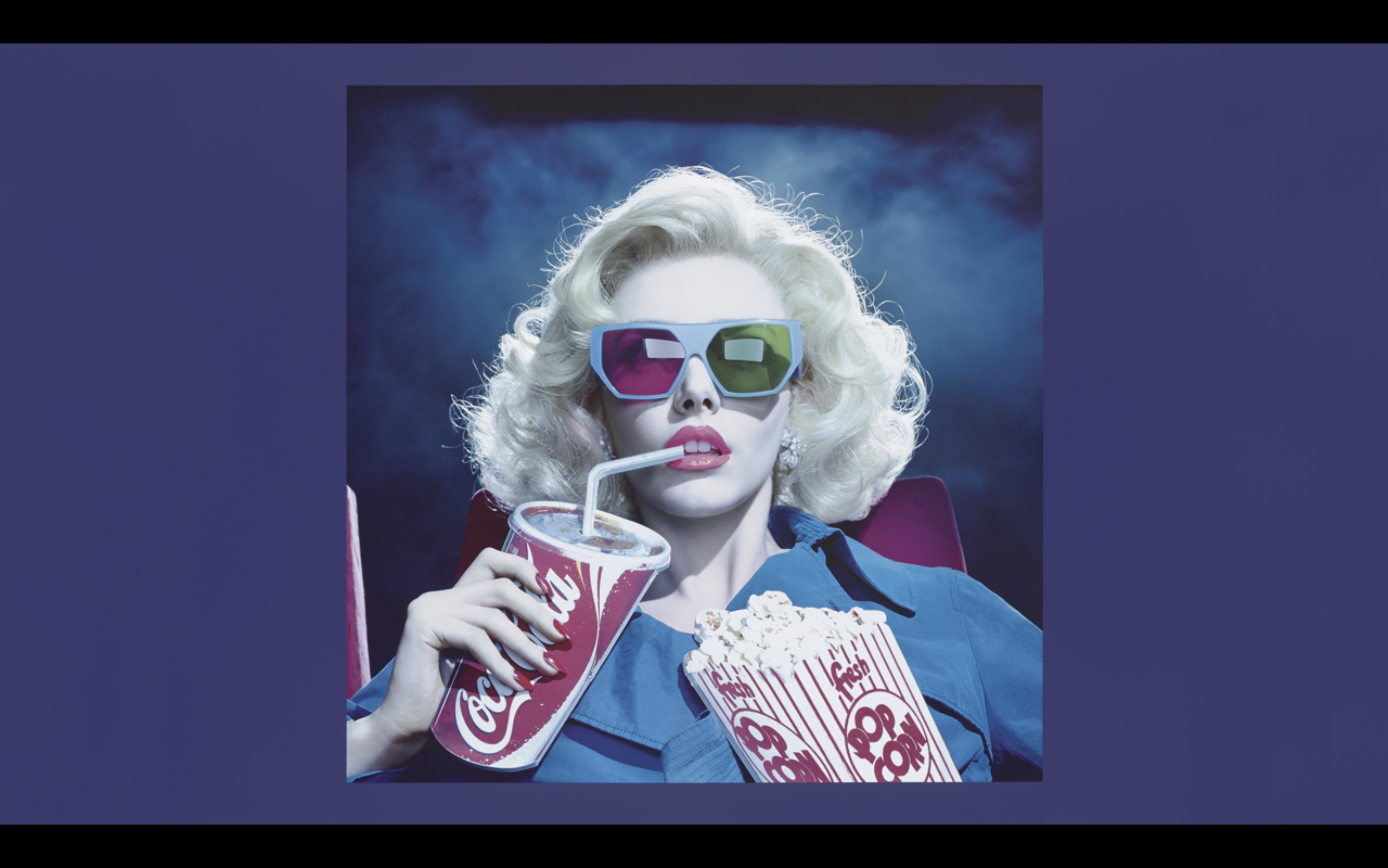
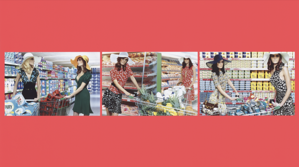
Miles Aldridge is a British photographer and artist who rose to prominence in the mid nineties with his remarkable and stylized photographs which reference film noir, art history, pop culture, and fashion photography. Miles Aldridge is the son of Alan Aldridge, a famous British art director, graphic designer, and illustrator, who is known for his work with notable figures such as John Lennon, Elton John, and the Rolling Stones. Alan Aldridge was the art director for Penguin books. His work is mainly characterized as a combination of psychedelia and eroticism. Miles thus grew up in an artistic environment even posing with his father for Lord Snowdon as a child.
Aldridge’s interest in photography started at an early age when he received a Nikon F camera from his father. At the age of thirteen, Miles was introduced to punk rock, and at the age of sixteen he joined a rock band called X-Men. Aldridge has mentioned that he found punk rock as ‘a great escape’ from his parents divorce. He went on to study graphic design at Central Saint Martins where he started out with painting and drawing, and later became a pop video director. By the age of 28, Aldridge became a fashion photographer at British Vogue where he worked for seven years as ‘Grunge Photographer’. The artist has stated that he had “a fascination with the model in front of the camera”. Aldridge found inspiration in artists such as Richard Avedon, a photographer who “balanced project work and fashion work”. Miles Aldridge’s works have been featured in magazine such as GQ, The New York Times Magazine, The New Yorker, and Harper’s Bazaar. Aldridge’s photographs have also been exhibited internationally at the National Portrait Gallery and the Victoria and Albert Museum in London, The British Museum, Fotografiska in New York and many more.
This article is based on Miles Aldridge’s interview with Bret Easton Ellis for Fahey/Klein Gallery.
Miles Aldridge, “Chromo Thriller #3”, 2012.
In addition to being inspired by photographers such as Richard Avedon and Helmut Newton, Aldridge’s works are also highly influenced by filmmakers such as Alfred Hitchcock and Pedro Almodóvar. “It began as a love of cinema and became an opportunity to make pop videos. My film education continued from there, watching films to find an idea. Hitchcock’s films always stayed with me, the most banal everyday objects become so sinister [in his works]. His stylization of life is what I find so true in a way”.
“It began as a love of cinema… Hitchcock’s films always stayed with me, the most banal everyday objects become so sinister”
Aldridge’s photographs mainly display female figures as the main protagonists of the images, to this end the artist has stated “when my parents divorced I was left with my mother when my father moved to LA, I watched this woman care for us, at the same time there was this sense of her falling apart… My childhood became caught up in intense melodramas, strange housewives and mothers who have this secret life. Whatever was bubbling up inside her was like a geisha, completely without expression, driving this turmoil inside but keeping this perfect face. When I started my own work I looked for these same characters on the screen, mothers tormented with a secret life and unspoken truths. When I stumbled across these characters in films is when I started creating a series called Home Works. The cake becomes a metaphor for a family while the mother is plunging a knife into it”. Thus, Aldridge always looks for a way to represent these personal yet collective domestic melodramas but in a way that is highly stylized, and therefore there are also no men in his pictures because according to the artist “enacting that would [make] it too real”.
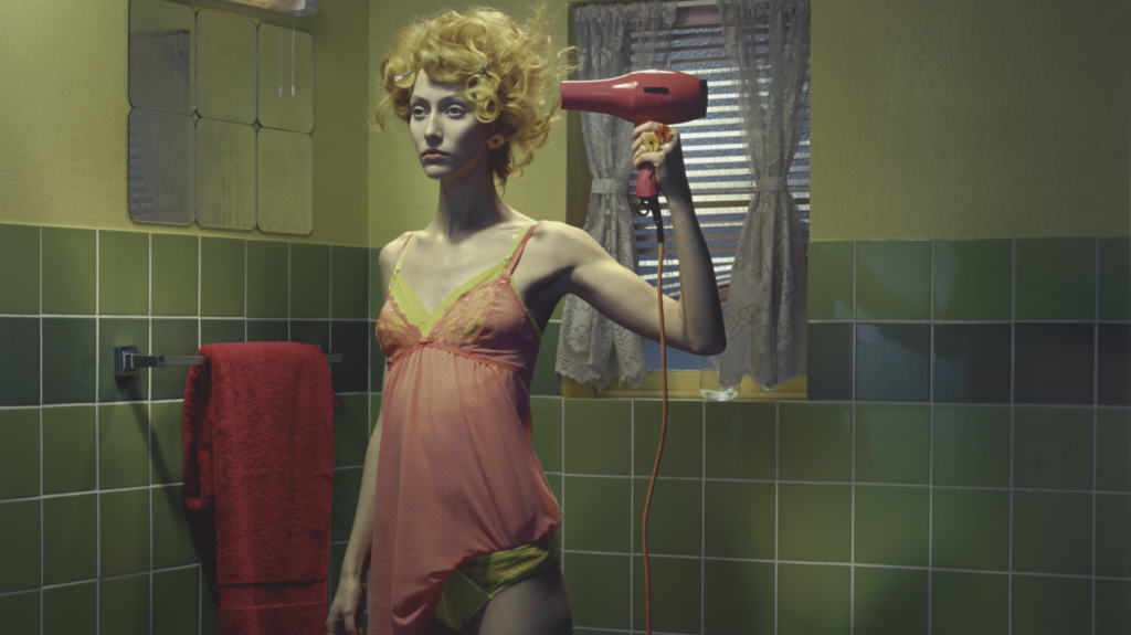
Miles Aldridge, “Impressions #1, 2, 3 Triptych”, 2006.
There is also the influence of painting in Aldridge’s works with his use of bright colors which he attributes to artists such as Francis Bacon, Henri Matisse, and Alex Katz. Aldridge’s works can often times be experienced as color experiments which he suggests are on the verge of a color overload. Apart from art history, Aldridge is also highly inspired by films.
“I was almost living my life through movies in a certain way… going to the movies to find answers for things”
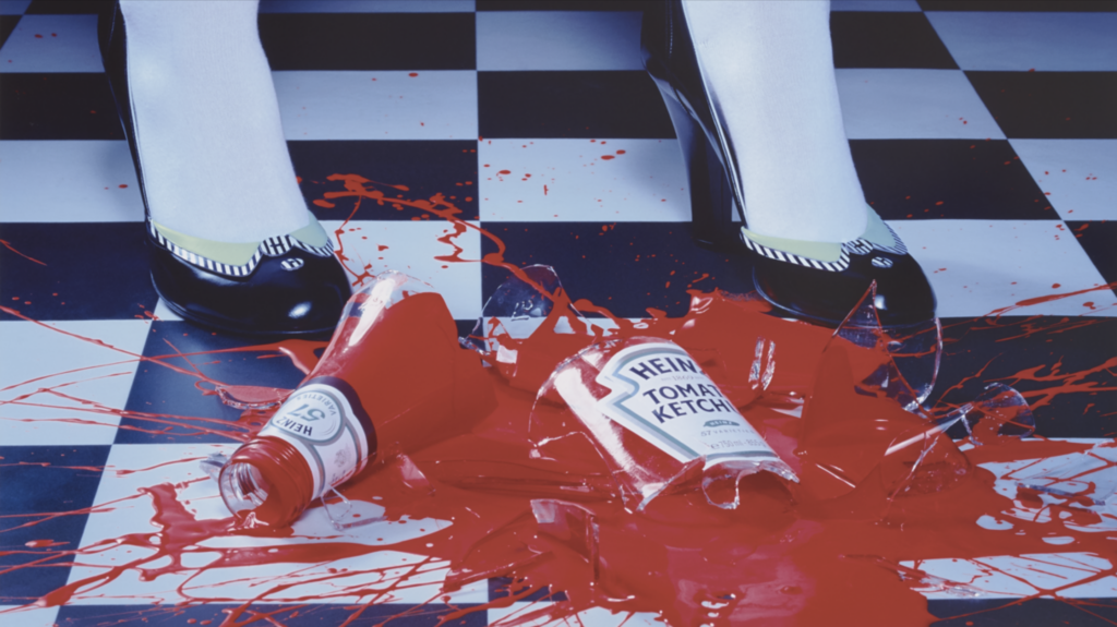
The artist has thus stated that he is very ״inspired by technicolor films where the color is beyond reality, like a red bus in a Hitchcock film”. Inspecting his work titled A Drop of Red #2 from 2021, one will realize that the substance overflowing from the broken Ketchup bottle is in fact much redder than it would be in reality. This is a technique used by the artist to exaggerate a scene taken from reality, and to create a certain mystery around the work. Furthermore, the artist relates to “the intense artificiality of photos”, and this is what he finds so powerful.
Miles Aldridge, “A Drop of Red #2”, 2021.
Towards this end Aldridge has shared his system “where I take a personal memory and take it through a scene of a film”. The artist then takes cinema and puts it into the realm of photography.
“I like the sense of eternity, when a figure seems to be permanently frozen. The power of an image is not to have a beginning, middle, and ending, but that it’s a complete universe. It’s like the figures are permanently there”
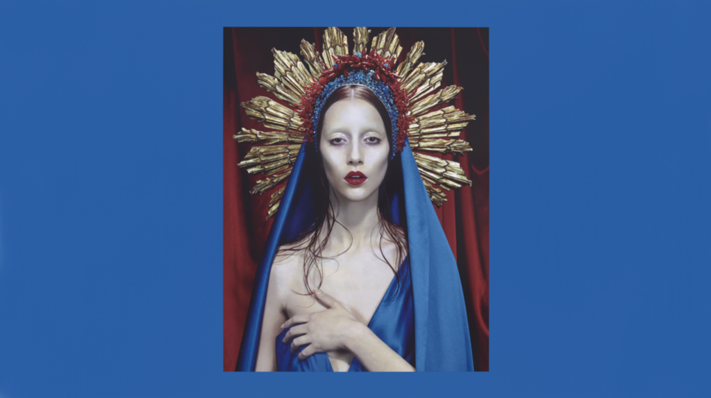
As part of his oeuvre, Miles Aldridge also created a series of religious images called Immaculée inspired by Black Narcissus a film by Michael Powell and Emiric Pressburger which focuses on a nun’s journey from the sacred to the profane. Apart from the story itself Aldridge was very inspired by “the technicolor process of the film, the use of strong gelled lights, fake painted skies and sets”, and this is what he calls an “incredible orgy of color” – these early technicolor films look a bit unreal in a way just like Aldridge’s works.
The Immaculée series was also inspired by Falconetti’s closeness to the camera, which can be interpreted like a piece of performance art.
This November we were invited by our partner Marriott, one of the world’s leading hotel companies, to demonstrate a selection of interactive artworks at BDNY: Boutique Design New York, the leading trade fair and conference for the hospitality design industry.
BDNY brings interior designers, architects, hotel owners and developers together, introducing them to the most innovative and high-caliber design elements for hospitality interiors around the world. Over the course of two days, we were able to demonstrate how the Niio platform enables art advisors, curators, architects and designers to implement digital art installations within their projects.
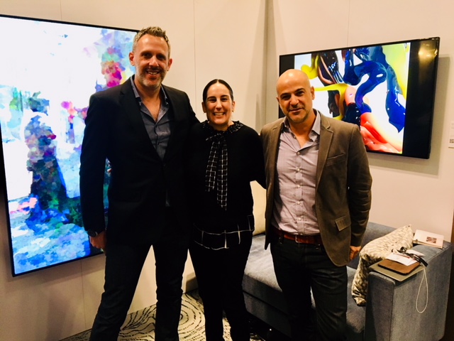
L. to R.: Rob Anders, Margo Spiritus & Yossi Amon; Featured Art: ‘Selfish Gene Mirror’ 2015 by Daniel Rozin; courtesy bitforms gallery; ‘Bodypaint III’ by Banz & Bowinkel.
We are on a mission to expose people to original, high-quality, immersive digital art experiences. With a collection of thousands of works from top artists and galleries, state-of-the-art technology, a global hardware infrastructure and white glove installation and support, Niio makes it easy to incorporate captivating digital art into any environment.
Want to discuss a project for one of your spaces? Please contact us or sign up for our Designer affiliate program.