Niio Editorial
This article is the first of a series about the symbolism of colors based on the writings of historian Michel Pastoreau. According to Pastoreau, in terms of their symbolism and adoption by human societies, we can only speak of six colors: blue, red, white, yellow, green, and black. Taking inspiration from his texts, we have curated six artcasts that show how artists use these colors in their work and exemplify the ways in which they are incorporated into digital art.
We invite you to learn more about the symbolic connotations of each color and experience the artworks on your own screen.
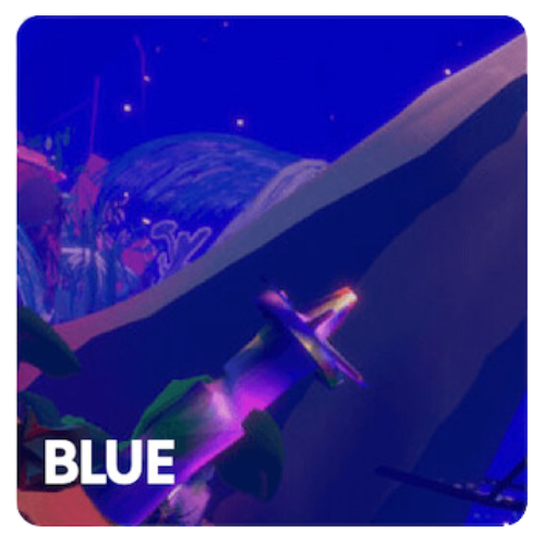
Discover the many shades of blue in digital art
Xenoangel. Supreme (video version, May ’22), 2021
Blue, the conformist color
Blue is the color that makes the perfect background. It doesn’t stand out, it is calming and invites consensus. Large organizations choose blue to denote sobriety and group consensus, as can be seen in the flags of the United Nations and the European Union. It is the color of the sea and the sky: a peaceful, quiet, conservative color. Pastoreau states: “since about 1890, blue became the prominent color in Western societies, as much in France as in Sicily, in the United States and New Zealand […] In other cultures something different happens: most Japanese, for instance, prefer black.”
Large organizations choose blue to denote sobriety and group consensus, as can be seen in the flags of the United Nations and the European Union.
However, blue has not always had these connotations. In ancient Rome, it was the color of the barbarians, the foreigners. There wasn’t a name for blue, which had to be borrowed from the Germanic blau or the Arabic azraq. In the 12th and 13th centuries, blue gained popularity in Europe thanks to the cult of the Virgin Mary, and was later adopted by royal families. In the 16th century, the Reformation promoted the idea that certain colors were more decent than others: black, grey, and blue became associated with correctness and adopted in masculine garments.
The invention of Prussian blue in 1720 popularized darker tones that were quickly adopted by Romantic painters and poets. In 1850, the Jewish tailor Levi-Strauss invented jeans, an indigo-colored trousers which introduced blue to the workspace, and later became associated with leisure, in the 1930s, and even a sign of a rebellious attitude, in the 1960s. Nowadays, blue is mostly perceived as a calm, conservative color, particularly in politics, as a reaction to the prominence of red in the communist regimes of the Soviet Union and China.
Patrick Tresset. Scene 11, Human Study #1, Hong Kong series, 2022
In the realm of the digital image, blue has acquired very different connotations: it can be electric, vibrant, an outlandish blue that can only exist in the virtual world. In 1993, Mosaic, one of the first web browsers, introduced blue hyperlinks to differentiate clickable text in addition to underscoring, which Tim Berners-Lee had introduced in his first browser in 1987. Standing out on the white, light gray, and yellow backgrounds of early browsers, blue became the color of the Internet in the 1990s. It has since been routinely adopted by tech companies, both for its association with electricity and machinery as for its dual conservative and rebellious symbolism. Leading social media platforms Facebook, Twitter, and LinkedIn use blue in their logos, denoting seriousness, consensus, and stability (although these words do not particularly apply to the current state of platforms such as Twitter). Blue has become the color of online communities, and even alternative channels such as Discord, Signal, or Telegram all use blue in their brands.
Sara Ludy. Rooms, 2012
Leading social media platforms use blue in their logos, denoting seriousness, consensus, and stability. Blue has become the color of online communities
The chroma key compositing technique used in film to combine two or more elements recorded separately initially used black or white backgrounds, until in the 1930s RKO Radio Pictures introduced the blue screen method. The Thief of Bagdad (1940), which won the Academy Award for Best Special Effects, was the first film to use this technique. Blue has since been used, alongside green, as a background in film sets, and therefore associated with visual effects, and particularly science fiction blockbuster films such as Star Wars.
The popularization of cyberpunk, a literary genre that responds to the utopian science fiction stories of the 1950s, brought a darker shade of blue to our visions of the future. Ridley Scott’s 1982 film Blade Runner, an adaptation of Philip K. Dick’s novel Do Androids Dream of Electric Sheep? (1968), pictured a dystopian future in a dark and rainy city of Los Angeles dominated by immense screens and neon lights. In William Gibson’s Neuromancer (1984), the sky is blue gray, “the color of television, tuned to a dead channel.” Blue has thus been associated with technology, science fiction, and virtual worlds since the 1980s and 1990s. It was partly replaced by the popularity of phosphor green, associated with hacker culture and popularized by films such as The Matrix trilogy (1999-2003), but was brought back by a wave of 1990s nostalgia exemplified in the work of Post-Internet artists in the early 2010s.
Alix Desaubliaux. Alexandra Erlich-Speiser, 2021
Nowadays, blue is used in digital art in the same way as in painting, to denote melancholy or to represent a blue sky or a calm sea, but also as a distinct color of virtual worlds and to symbolize artificiality. Blue continues to be a conformist, calm color, but in our digital society it has also become associated with connectivity, ubiquity, and community.
Explore our color-themed artcasts